Forecast Plotting
Importing the Forecast Plotting Module
To help participants visualize their sub-seasonal forecasts, the AI-WQ-Package includes a dedicated module called plotting_forecast. This module allows you to easily plot Quest-compatible forecasts.
To import the necessary plotting function, use:
from AI_WQ_package import plotting_forecast
Plotting a forecast
The plotting_forecast module provides a set of high-level plotting functions designed to visualise forecasts contributed to the AI Weather Quest.
The module includes three overarching plotting functions:
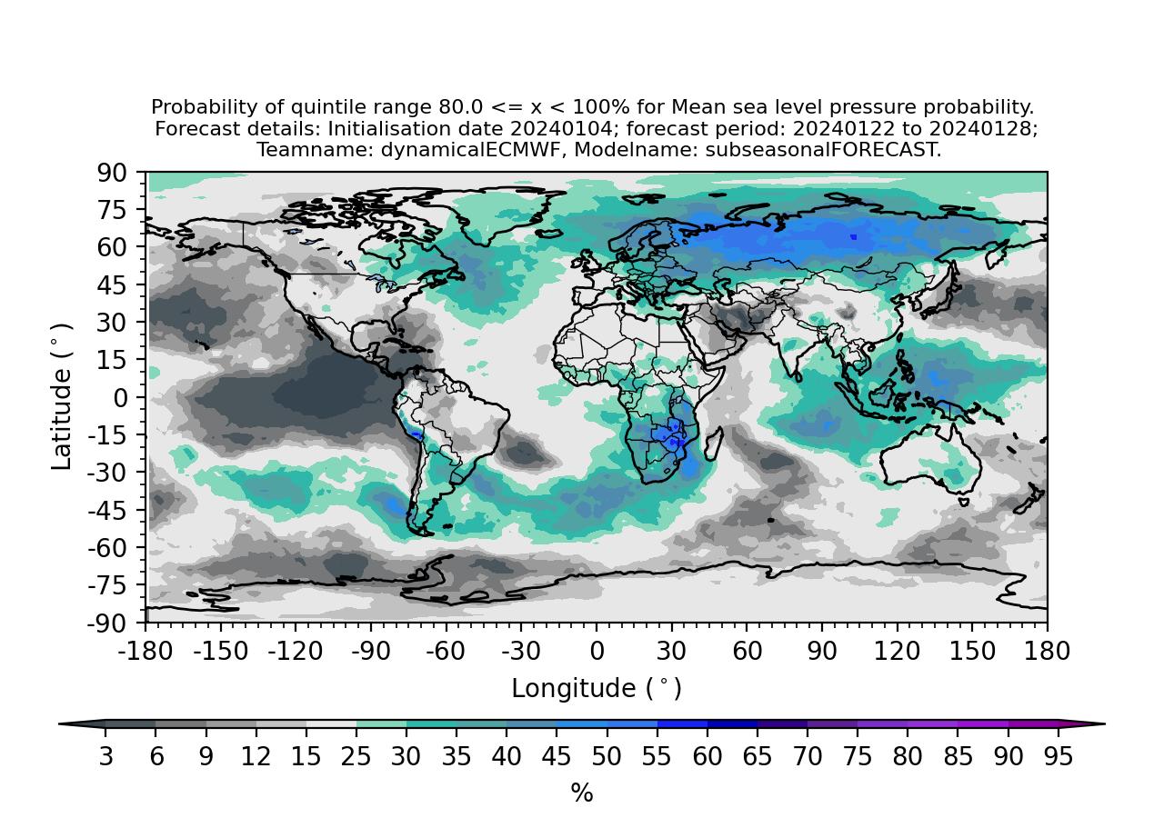
plot_forecast Generates a spatial map displaying probabilistic forecasts of near-surface temperature (tas), mean sea level pressure (mslp) or precipitation (pr) for a specified quantile range.
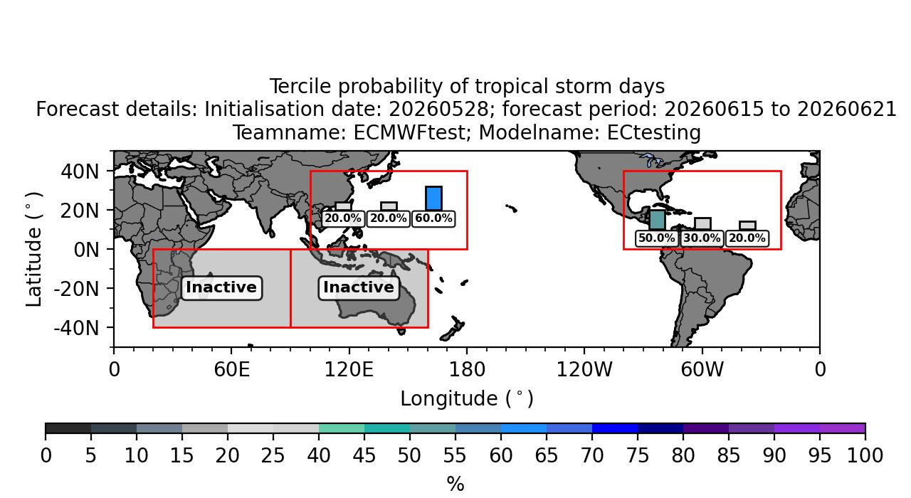
plot_TS_forecast Produces a map showing tercile-based forecast probabilities for the number of tropical storm days across each active ocean basin.
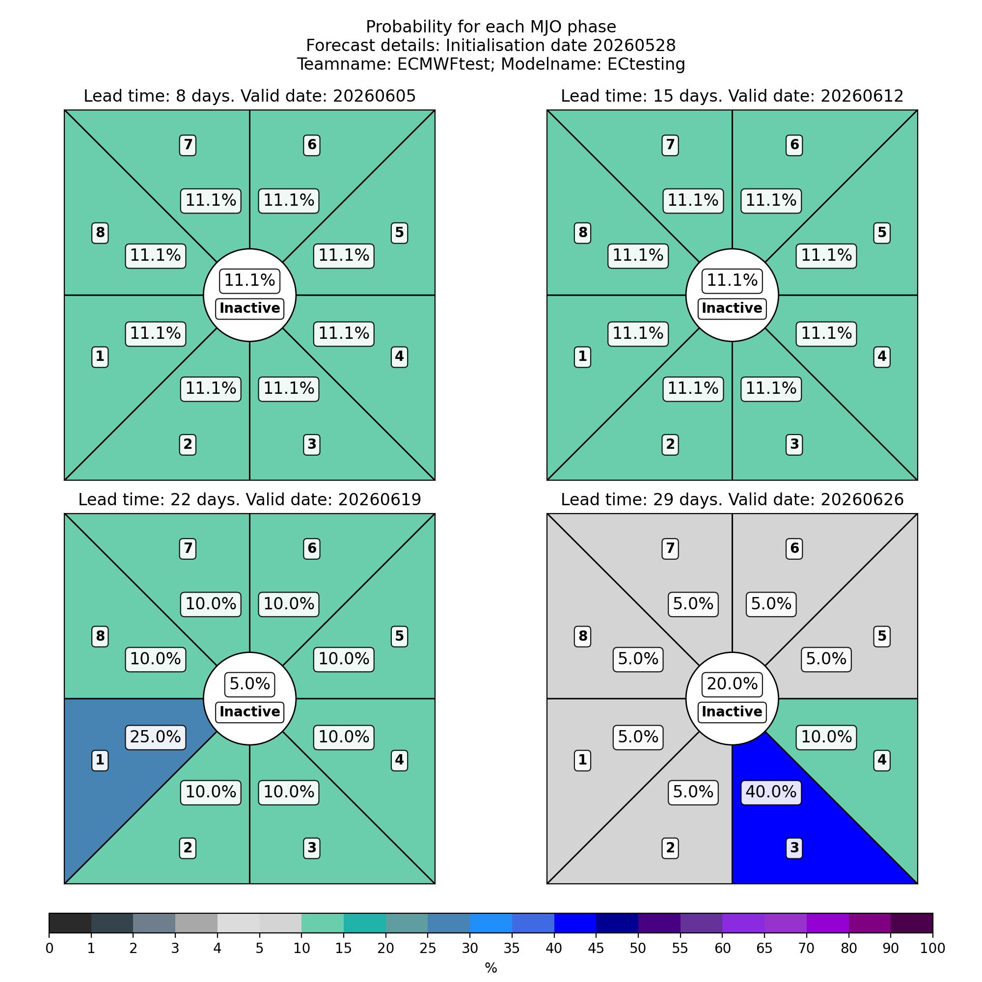
plot_MJO_forecast Creates a collection of Wheeler–Hendon phase-space diagrams illustrating forecasted probabilities for each phase of the Madden–Julian Oscillation (MJO).
All three functions generate figures that match the visual standards, colour schemes, and layout conventions of the AI Weather Quest forecast portal, ensuring consistency between locally generated outputs and publicly displayed forecasts.
Each function also supports the following optional arguments:
local_destination (str, optional): The path to the local folder where the figure will be saved. If not provided, the figure will be saved in the current working directory.
format (str, optional, default = ‘jpg’): The output file format (e.g. ‘jpg’, ‘png’, ‘pdf’).
1. Plotting quintile-based probabilistic forecasts
The plot_forecast function generates a map showing a probability forecast of either tas, mslp or pr for a given quantile range.
The plot_forecast function only has two necessary inputs:
plot_forecast(<<forecast>>,<<quintile_num>>,local_destination=None,format='jpg')
forecast (xarray.dataarray): Your submitted forecast to the AI Weather Quest.
quintile_num (int or str): The selected quintile where 1 refers to < 20%, 2 refers to 20 <= x < 40% etc.
The figure filename is automatically created using forecast attributes. The format is:
<<variable>>_<<fc_init_date}>>_p<<fcwin>>_<<teamname>>_<<modelname>>_quintile_<<quintile_value>>.jpg
where:
variable: Forecasted variable (e.g. tas, mslp or pr).
fc_init_date: Forecast initialisation date in format YYYYMMDD (e.g. 20250403).
fcwin: The sub-seasonal forecasting window (either ‘1’ or ‘2’).
teamname: The teamname associated with the submitted forecast.
modelname: The modelname associated with the submitted forecast.
quintile_value: Upper limit of the selected quintile (e.g. 20, 40 etc.)
Note
The plot_forecast function only works with Dataarray templates provided through the AI-WQ-package.
Example Usage
Here is how you might use the function to generate a forecast plot for the 60–80% quintile range:
from AI_WQ_package.plotting_forecast import plot_forecast

# Plot the 4th quintile (60 to 80%) and save to a local folder ('/home/test_figures/')
plot_forecast(submitted_forecast,4,local_destination='/home/test_figures/')
Below is an example forecast figure showing predicted probabilities of mean sea level pressure being between 80.0 and 100.0% of climatological conditions for the week commencing 22nd January 2024. The forecast was initialised on the 4th January 2024 and based on ECMWF dynamical sub-seasonal forecasts.
2. Plotting tercile-based probabilities of tropical storm days
The plot_TS_forecast function generates a global map showing tercile-based probabilistic forecasts for the number of tropical storm days in each active basin.
The function displays forecast probabilities using coloured bars within predefined ocean basin regions. Basins that are seasonally inactive during the forecast period are highlighted using a greyed-out box labelled Inactive.
The plot_TS_forecast function has a single necessary input:
plot_TS_forecast(<<forecast>>, local_destination=None, format='jpg')
forecast (xarray.DataArray): A submitted tropical storm forecast following the AI Weather Quest data template. The data are expected to represent tercile-based probabilities for each basin.
The figure filename is automatically generated using metadata extracted from the forecast object and follows the format:
TS_<<fc_init_date>>_p<<fcwin>>_<<teamname>>_<<modelname>>.jpg
where:
fc_init_date: Forecast initialisation date in YYYYMMDD format.
fcwin: The sub-seasonal forecasting window (either ‘1’ or ‘2’).
teamname: Team name associated with the submitted forecast.
modelname: Model name associated with the submitted forecast.
The colour scale represents tercile probabilities expressed as percentages, and the map extent is restricted to latitudes between 50°S and 50°N. Seasonal basin activity is handled automatically based on competitive period.
Note
The plot_TS_forecast function only works with tropical storm forecast files provided through the AI-WQ-Package and assumes basin definitions consistent with the AI Weather Quest training data.
Example Usage
The following example demonstrates how to generate and save a tropical storm probability forecast map:
from AI_WQ_package.plotting_forecast import plot_TS_forecast

# Plot tercile-based tropical storm probabilities
plot_TS_forecast(submitted_TS_forecast,
                 local_destination="/home/test_figures/")
Below is an example figure showing tercile-based probabilities of tropical storm days for each active basin during the forecast period. The template forecast was initialised on 28th May 2026 and shows predicted probabilities of tercile-based tropical storm days for week commencing 15th June 2026.
3. Plotting MJO phase probabilities
The plot_MJO_forecast function generates a figure with multiple Wheeler–Hendon phase-space diagram showing probabilistic forecasts for each phase of the MJO.
Each panel represents a different forecast lead time and displays the probability (%) of the MJO occupying each of the eight standard phases, along with the probability of an inactive MJO state. Phase probabilities are visualised using shaded sectors coloured according to a predefined probability colour scale.
The plot_MJO_forecast function has a single necessary input:
plot_MJO_forecast(<<forecast>>, local_destination=None, format='jpg')
forecast (xarray.DataArray): A submitted MJO forecast following the AI Weather Quest data template. The array is expected to contain probabilistic values for MJO phases 1 to 8 and the inactive state, for multiple forecast lead times.
The figure filename is automatically generated using forecast metadata and follows the format:
MJO_<<fc_init_date>>_<<teamname>>_<<modelname>>.jpg
where:
fc_init_date: Forecast initialisation date in YYYYMMDD format.
teamname: Team name associated with the submitted forecast.
modelname: Model name associated with the submitted forecast.
The colour bar represents phase probabilities expressed as percentages. The inactive MJO state is shown as a central circular region, while active phases are displayed as sector-shaped regions following the standard Wheeler–Hendon phase definition.
Panel titles indicate both the forecast lead time (in days) and the valid date for each forecast.
Note
The plot_MJO_forecast function only works with MJO forecast files provided through the AI-WQ-Package and assumes a standard eight-phase Wheeler–Hendon MJO definition.
Example Usage
The following example demonstrates how to generate and save an MJO phase probability forecast figure:
from AI_WQ_package.plotting_forecast import plot_MJO_forecast

# Plot MJO phase probabilities and save to a local directory
plot_MJO_forecast(submitted_MJO_forecast,
                  local_destination="/home/test_figures/")
Below is an example figure showing forecast probabilities for each MJO phase at multiple lead times. The template forecast was initialised on 28th May 2026.